
As Saudi Arabia prepares to host the 2034 FIFA World Cup, the conversation is no longer only about the tournament as a global sporting event. The logo and visual identity have also become an important part of understanding the message Saudi Arabia wants to present to the world.
The logo reflects a clear combination of Saudi identity, global ambition, and future-oriented development. Through its visual details, it is clear that the design is not only based on aesthetics, but also carries symbols connected to culture, nature, and openness to the world.
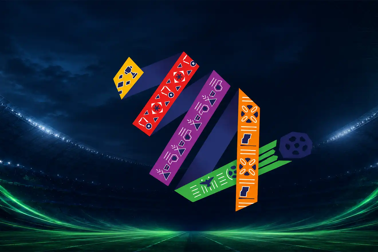
The Idea Behind the Number 34
The colored ribbons in the logo form the number 34, directly referring to the year 2034, when Saudi Arabia will host the tournament.
This smart use of the number does more than communicate the year. It turns it into a visual element associated with movement, growth, and ambition. The design suggests that the tournament is not just a single event, but part of a continuous journey toward development.
Color Symbolism in the Logo
The logo uses a set of colors that reflect the cultural and geographical diversity of Saudi Arabia.
Orange symbolizes generosity and authenticity, reflecting the warmth of Saudi culture.
Green is connected to the Saudi flag and also represents the beauty of oases and green landscapes in the Kingdom.
Red is inspired by the coral reefs of the Red Sea, adding energy and vitality to the identity.
Purple reflects the color of the lavender flower, connecting the identity to natural beauty and environmental diversity.
Yellow represents ambition, brightness, and the dreams of the Saudi people for the future.
Ribbon Movement and Connection
The interwoven ribbons create a sense of movement and continuity, expressing the connection between Saudi Arabia and the world through football.
This visual interaction is not only decorative; it reflects communication, participation, and openness to different cultures that will come together in one global sporting event.
Arabic Typography and Local Identity
The use of Arabic typography gives the logo a clear sense of authenticity and reinforces the idea that the tournament carries a Saudi and Arab identity, even while speaking to a global audience.
The combination of Arabic and English reflects Saudi Arabia’s desire to present a global experience with a local spirit, bringing together authenticity and openness.
The Slogan and Its Message
The slogan “Growing Together” expresses Saudi Arabia’s vision of making the 2034 World Cup a shared experience between the Saudi people and football fans from around the world.
The message goes beyond football. It speaks about growth, cooperation, and cultural exchange created by an event of this scale.
A Marketing Perspective on the Logo
From a marketing perspective, the logo is effective because it does not only represent a sports tournament. It builds a complete visual story. Every color, movement, and design element supports a bigger idea: Saudi Arabia as an ambitious, evolving country connected to the world.
This is where the power of design appears. A logo is not just a symbol placed on posters and screens; it is a communication tool that expresses the vision of an entire country to a global audience.
The Saudi Arabia 2034 World Cup logo is a strong example of how visual identity can carry a story, a culture, and an ambition within one design. Through its colors, movement, typography, and message, the logo presents a modern identity that combines Saudi authenticity with global presence.
This type of design proves that a successful logo is not only seen; it is read, understood, and remembered.